Ugliest Raglan of All Time... or is it?
Posted: Fri Apr 02, 2010 11:46 pm
1. A bizarre shade of green made all the more disturbing by fading.
2. A logo of the same colour making it even harder to look at.
3. A half-cutesy, half-artsy approach to said logo, which only comes off as all creepy.
This could only have come from the Canadian Broadcasting Corporation. They can't make decent television, so why would they do well with a baseball shirt?
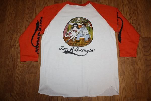
I say this is the Ugliest Raglan of All Time. But what say you? Grab your beat-up raglans and challenge me. I choose this kind of shirt because there's more potential for weird fading and inappropriate clashes with designs when you've got two colours on the shirt. So find that combination of bad style with unfortunate distressing and prove me wrong!

