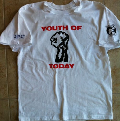
At first, I was pretty amped on this tee. When it comes to bootlegs, this isn’t one you see very often. 4 sided is a pain in the ass to boot. And the lettering on the sleeve seems to be some long lost forgotten font. No one ever seems to get it right. But this one looks like it has an appropriate sleeve print font. I can’t be certain, but it seems close. And drewtilldeath1986 is quick to point out that it is “not a crumby euro boot.” He also mentions there is no phallic chunk of cotton missing — we see what you did there, dude!

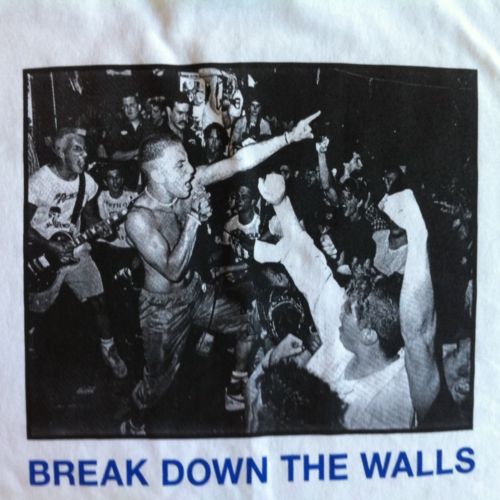
But, I can still find fault with this tshirt. How or why, you may ask. Simple. Look at the print on the back. You know what’s wrong here? It’s too fucking perfect. This image was probably scanned from the lp at 300dpi and put on the shirt. That’s great for picture clarity. Not great for reproducing the shirt. Anyone who owns or has seen an original can tell you. The back print was super black and not very detailed. As if Pat Dubar (or someone) went to Kinko’s, photocopied the LP sleeve and used the resulting photocopy as the picture. Go ahead, look it up on any “shirt site.” You’ll see that I’m telling the truth.

Regardless, it’s a pretty cool shirt. The sleeve font is a little wacko (notice the lack of spacing between the P and the comma) but it’s close. And the back pic is detailed, but not like the original. You take the good, you take the bad …


This is the best looking boot of this shirt that has been done. If somebody wants to pay $200 dollars for an og they can. I do agree it is not dead on the OG, but that is just it, its not OG.
Agreed. It’s pretty spot on for the YOT WW tee.
WOULD wear the fuck out this shirt. #Swag #IHateRayCappo