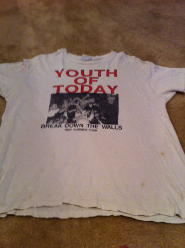
Here on TTD, Casali and I often end up trying to write up the same auction at almost the exact same time. And usually we end up arguing back and forth over whose claim precedes whose. But in the case of this 1987 Youth of Today tee being sold by eatbiggetbig2010 (great user name, btw), we’re actually arguing over who gets to sit out. Because neither of us dig this tee.

Blah. Just a boring, boring tee. Totally lame design, it looks like a bargain bin bootleg. I also am holding the hideous Break Down The Walls remix artwork against this tee, because I’m pretty sure it’s the same live shot. Not to mention the fact that 200 bucks is a pretty high start for a tee that looks to be just a fade or two away from being in the condition of the Inside Out and Chain of Strength tees we saw last week…
We’ll bring you some of this seller’s other auctions later on, as he does have some stuff we like up for sale. It’s just this one tee… we can’t get down.


great shirt. wish i had an extra few hundred dollars to drop on this.
Awesome shirt, love the simple design and the font is awesome. But I fail to understand why the seller put nail polish on the holes? It makes the shirt look dingy and stained.
i think the nail polish is to prevent the holes from getting bigger. haven’t read the description, fuckin hate descriptions that go “here is the holy grail of holy hardcore grails blaaa” so no idea if he states why he did it. he would have been better off letting his mom or some tailor repair those holes. so yeah, seems like the owner sure didn’t treat it like something so special.
I am the seller. I did the nail polish BS when I got the shirt like 9 years ago. Would I do it today? No, dumb teenage move but it looks worse in the picture than in real life. As for the price, I realize it is high, but I’m not dying to sell the shirt unless someone wants to pay that much.
Russell : Love the font? Really? What a miss…normally YOT have some great design choices…this one, not so much.