I like “not blowing smoke up your ass” in the Bane hooded sweatshirt description had me laughing. It was a quality laugh out loud moment. Judging from some of the other description wordings, I’m assuming the seller is a reader of this site. Speak up if you are out there. Kudos are due!
Now for the correction part, which is actually more of a clarification on detail, I suppose. In this first Reach The Sky tshirt description, the seller says, “I think this one is also from the pre-Victory days, but someone correct me if I’m wrong … Regardless of what era it’s from, this shirt is killer.” These are all correct. But it would be more accurate to say that this shirt is the SECOND Reach The Sky design. WAY before Tony Victory came a knocking. I’ll wholeheartedly agree that it is a killer shirt, of course. I’ve seen it in this blue and a hunter green. You know I prefer the hunter green.
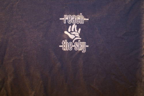
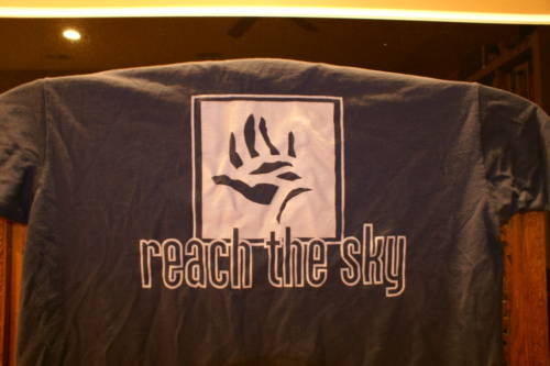
This shirts slays me too. I love the plain graphic font on the front, great color choice too. Sadly, the overbearing, yet tiny ECER logo sort of kills it for me. It just doesn’t fit or match at all.
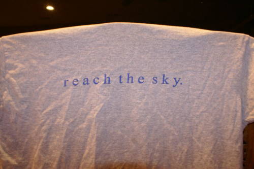

And this last one, well, I can’t hang. It’s just a little too corny in the graphic department for my taste. I like clean and simple. This was neither, really. Maybe I haven’t reached that point in my life yet. Too soon for me? Maybe next year.


What can I say, I like to provide a quality read!
Thanks for the info on that first RTS shirt, I used to have another one that I always thought was their first shirt, navy blue with a big yellow tree on the front. Seemed hand-screened to me.
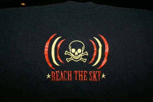
I never really cared too much for the last shirt, really, just wanted it for the collection. The clip-art skull is definitely corny.
I have that last shirt and I have to say I was A
little dissappointed that skull is a wingdings font i believe. I also find it funny how that first shirt looks alot like the bane “hands ” shirt
Yo Shane
Pretty sure that navy tee with a big yellow tree IS the first RTS design.
Where’s Larry B for some facts and figures?
Kinda weird to be randomly perusing the blog and to see you asking for my input…
The “tree” shirt referred to above as the first shirt, while true, was a random design we made on a whim for one show. I photocopied the cover of a Seratonin 7″ (some Crank! records type band from Tennessee) cut off their logo and typed out reach the sky in large times new roman font. I think Chris’ brother had a screenpress and he made like 12 shirts with it. We sold 1 or 2 and gave or threw the rest away. Strike one in the merch department. Which leads to….
The “hands” is really the first shirt we did. Anthony Pappalardo designed it for us and we did it in blue/ silver, green/silver and red/silver. Its definitely pre Victory but we might have still been making them in 99 when the first Victory 7″ came out. I am pretty sure that shirt and the original CCM version shirts we our exclusive merch from 97-99, until the So Far From Home record came out.
The second shirt Dave Duncan from East Coast Empire Records made on his own to sell for a short while in his store and in the ECER distro. Pretty bland. I think it was in grey and in white. I am certain we never sold them on the road, so the owner had to have ordered it from ECER. The font on the front matched the promo stickers and postcards he made for the Open Roads EP and 7″. AJ reviewed Open Roads in his Truth Will Out fanzine and it said RTS might be his favorite band. Bedard showed me the review at the 2nd BTSJ (Hatebreed etc in Cambridge) and I was psyched.
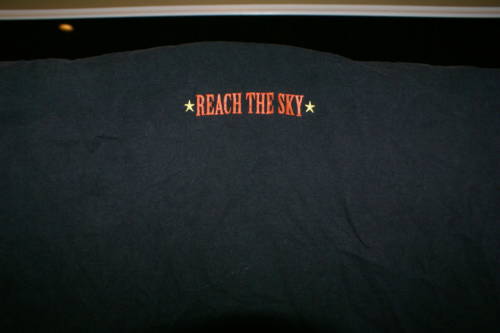
The black shirt is 2000 era. Probably for the Misfits tour or Warped Tour or something like that. Yes, its clip art. Yes, it doesn’t stand the test of time, but it was hot for us for a long time. We sold a hoodie with that same skull thing down the sleeves that was also a big seller. I recall that a lot of bands during this time started incorporating similar designs into their merch. I always loved the small logo/ image on the back collar look and we did it pretty regularly. Does anyone even do that anymore? John Lacroix designed it for us.
This response is one of the reasons why I love writing for this blog. Some great insight, thank you Ian.
Red/Silver. Whoa, this sounds like a very amazing color combo which I have never witnessed. Must look into this.
Son of a… the story behind me having the tree shirt is that I won some contest that I believe Lacroix had years ago, basically clearing out a bunch of random stuff he had for review, if I remember correctly. I end up getting a 15 pound box in the mail, full of CDs, records, some zones, and that shirt.
Fast forward a few years, and I get hit by a car while wearing said shirt. It ends up getting kinda messed up, with a few holes. Eventually, I let my wife use it to make a quilt. I’m REALLY kicking myself in the ass now that I know how few of them there were. Great design, too. Fuck.