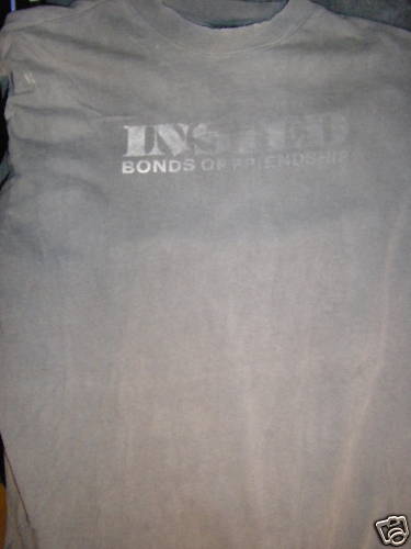
It’s like a youth crew party around here. Here is a show bought early INSTED chet design shirt. The front is mega faded, but the back appears to be semi-crisp. This is a design that does not come up too often.

I am personally not too fond of that font on the front of the shirt. Never have been. It bugs the crap out of me. I have issues.


Like the gray color never seen it before
“I have issues.”
Yeah issues of taste… the front of this shirt is crap, those two fonts do not go together at all and moreover why have your band listed in two different fonts on one shirt? Back of this is backed hard. Front is weak but maybe the owner agreed with us and wore the shit out of the front.
I assume you mean “issues of GOOD taste” as he definitely is hating on that front font too.
I indeed mean “good” taste. I am in complete agreement with him.
“Front is weak but maybe the owner agreed with us and wore the shit out of the front.”
Yeah. never seen that color combo before.