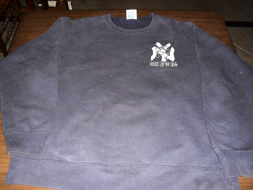
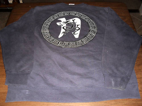
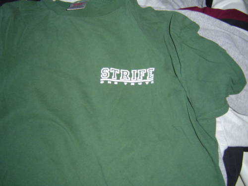
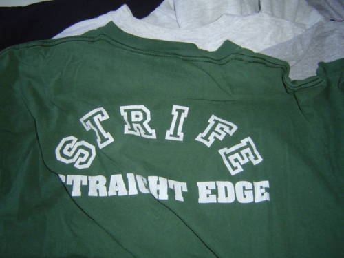
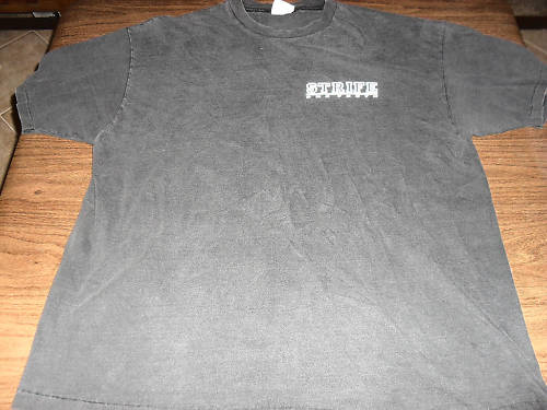
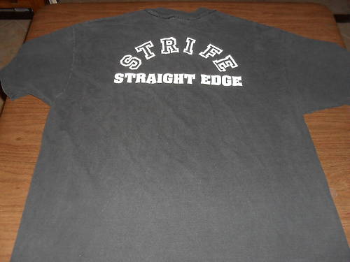
I like “not blowing smoke up your ass” in the Bane hooded sweatshirt description had me laughing. It was a quality laugh out loud moment. Judging from some of the other description wordings, I’m assuming the seller is a reader of this site. Speak up if you are out there. Kudos are due!
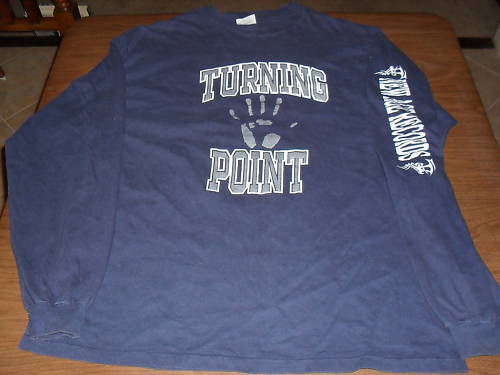
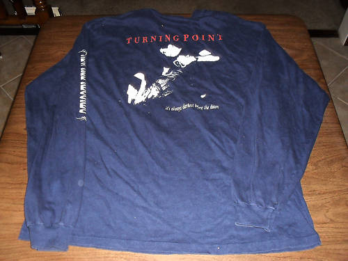
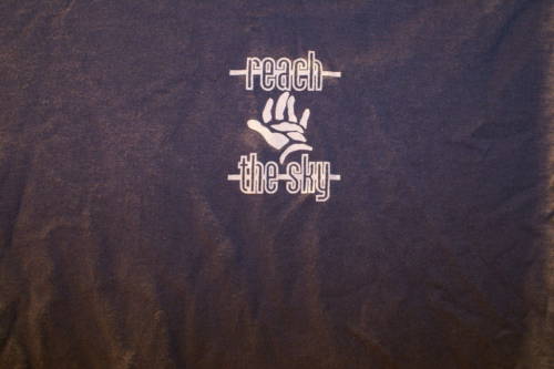
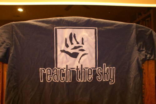
Now for the correction part, which is actually more of a clarification on detail, I suppose. In this first Reach The Sky tshirt description, the seller says, “I think this one is also from the pre-Victory days, but someone correct me if I’m wrong … Regardless of what era it’s from, this shirt is killer.” These are all correct. But it would be more accurate to say that this shirt is the SECOND Reach The Sky design. WAY before Tony Victory came a knocking. I’ll wholeheartedly agree that it is a killer shirt, of course. I’ve seen it in this blue and a hunter green. You know I prefer the hunter green.


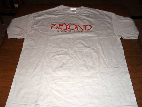
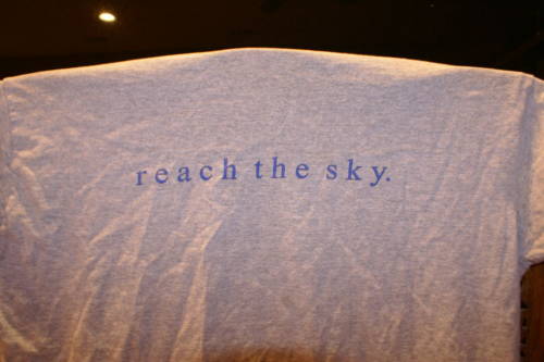
This shirts slays me too. I love the plain graphic font on the front, great color choice too. Sadly, the overbearing, yet tiny ECER logo sort of kills it for me. It just doesn’t fit or match at all.


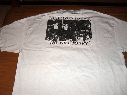
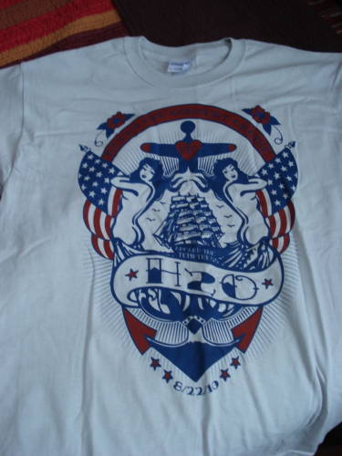
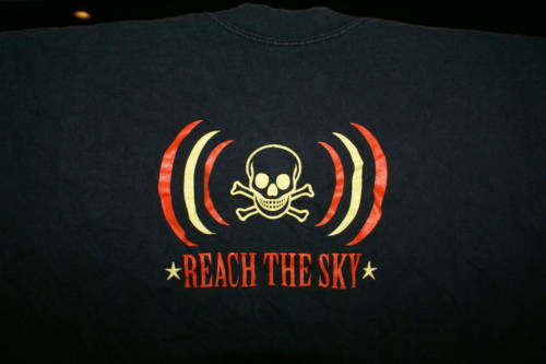
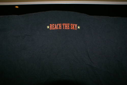
And this last one, well, I can’t hang. It’s just a little too corny in the graphic department for my taste. I like clean and simple. This was neither, really. Maybe I haven’t reached that point in my life yet. Too soon for me? Maybe next year.

 Continue reading »
