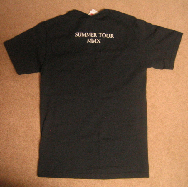
I know you’re thinking, “Subtle? How the fuck is this tshirt subtle?” Well, let me explain. Despite the oversized front graphic, at the base of it all lie the subtle touches. The crisp lines, straight angles, everything just works. Font is stellar and the reverse REAPER? Throw in a yellow bolt and BAM, grand shirt. Just great stuff. And then the back is killer. A little font between the shoulder blades. I’m sold. Everything about it reminds me of soccer jerseys or team throwbacks. Anyone got an appropriate reference nod for this one?
merchnow IF there are any leftovers. May not happen, obviously. Hot shirts sell out. Fact of life.


 Fabricated is our weekly series comparing


*guess it doesn’t fit her :) i love this print and simple design, but it doesn’t lay flat on me so it bunches up and just looks bad. such is life.
Oops, 1000 apologies. Great shirt though, too bad it doesn’t fit right.