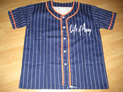
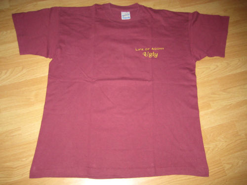
I must have subconsciously decided that I wanted to torture myself today, because I managed to save all of the ugliest gear from janvanderdam’s otherwise excellent auctions all for one day…


These are nowhere near as bad as the pastel patterns of puke (that makes no sense, I just wanted to use alliteration) I showed earlier, but they’re nothing I’d want on my torso either. The maroon shirt is just plain boring (and maroon), and the baseball jersey is a baseball jersey. They never look good off the field.
edit: well, they must not have been ugly to someone, since between the time this was scheduled last night and posted this afternoon, the BIN’s have been snatched up. Whammy!

 Fabricated is our weekly series comparing


ur crazy. thats a good ny metropolitans colour scheme right there.
Color scheme is fine, it’s the composition I can’t stand.
that maroon shirt looks so cool