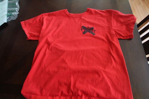
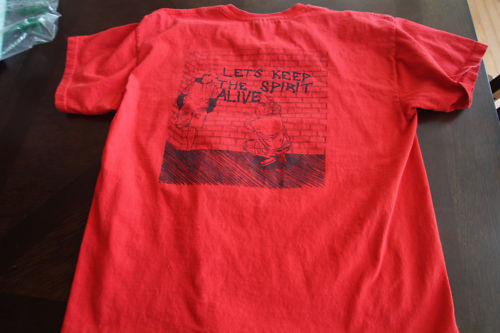
Our buddy Jay made this shirt for the on his blog. It’s a good read. Sadly, this shirt looks … not good. I can’t tell if it’s the pictures or the red shirt, black ink combo. Everything looks super washed out. Anyone have a white one? I bet it works better on white. The front is basically indecipherable. Weird.


Check out the other items from in_vinyl_we_trust.


 Heat Check rounds up the highest-selli
 Vintage Streetwear Giveaway Alert!


Nah it’s the pics…I wore this maybe 5 times so it is not washed out
I set the flash to off for these and the result is some not so crisp images :(
still looks better than that united youth-shirt.